GRAYSCALE-
Or How I Learned To Stop Worrying And Love Photoshop
My scanner kinda blows. It'll pick up detail until the cows come home, but God help it it can't scan anything thats actually black. I have a theory it's racist. (On an aside, it can't even remotely scan color right either. If I ever do a painted comic like I want to, my first step will be throwing this thing off the roof of my building)
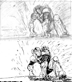
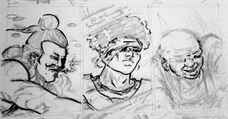
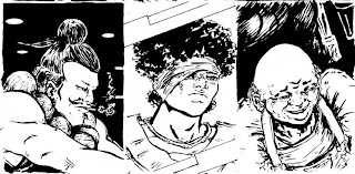
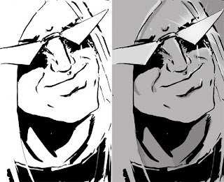
I scan everything in in grayscale, which the scanner can handle, and manually adjust everything with Curves. In my youth I used Levels, until everyone I knew yelled at me about it, and I can now admit they were right. This is also where I make my corrections. Sometimes it's not just a little whiteout either. I also can use this step to fix certain miscalculations, such as Issalai's mouth below, which now matches how I inked it in the rest of the chapter.
I want Benthic to be atmospheric, so I actually go out of my way to do different things at the grayscale stage. Different brushes, different methods of compiling, etc. If I don't keep this stage fresh I find it painfully boring. There are much better Photoshop tutorials floating around the internet if you're really into it...the truth is with Photoshop, I'm good but I'm not great. There are a few key things I usually do.
I usually use two or three different layers, all set to Multiply. Unless I'm intentionally going for a graphic effect, I usually set the opacity on my brushes pretty far down. Shape Dynamics being on is an absolute must, and Other Dynamics is usually on too. There are also sections where I kinda whore out gradients. I usually make one, copy the layer and then erase out whatever is in the foreground, and then make lots of copies of the background gradient and/or unifying gradient until I get it where I want.
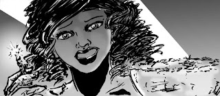
Once the grayscayle image is good, I now switch it CMYK. Theres the correct way, and my way.
The correct way to do this is probably to keep source files of the grayscale, flatten the image at conversion and save a separate CMYK file; but InDesign is tied to the original file name and tha'ts where I figured out how and where I wanted everything cropped to begin with.. The only way I figure to get around this without manually relinking everything is making secondary source backups, storing them elsewhere, later renaming them, and making the original file names the flat versions. Fuck. That. I'm too busy as it is. Working in CMYK has its own host of issues I'm not dealing with either.
I just don't flatten the image, and re-tweak it once its CMYK. Yes it changes the images a bit (sometimes for the better, hooray!) but rarely is it earth shattering and almost never something I can't fix.
LETTERING AND BEYOND-
Which brings us to where I am now. These pages need text.
Remember back in Process 1, when we had less-bad dialogue? Now it all needs fixed before it can go on the page, and here's where I REALLY screwed myself. Whatever changes I make to the dialogue still has to fit the now-complete art and the facial expressions, gestures, and space allowances made. This severely limits my options. From here out I'm not penciling anything that doesn't have dialogue unless said dialogue is someone else's problem and this is how they want to do it. Ever.
Oh right! Lettering. On the existing versions of Chapter 1 and 2, I did the text bubbles in Illustrator, dropped in each bubble as a separate file, and set the text over it in InDesign again. Needlessly complicated with the added bonus that I'm rusty as hell in Illustrator. Right now, after much discussion with people I trust, the smart move with this process is to do all the lettering in InDesign itself with the pen tool and pathfinder. I've never done it before, so we'll see how it works out when the script revisions are finished and I start lettering.
The final book layout, before it goes to printing, is pretty easy to dial in since everything is already in InDesign anyway.
That's all I know and I'll I've got. I'll post some reflections, and some material and technique stuff next week.


